Usability Posts

How Are You “Wrapped”?

I’m writing a book and find myself leaving my office to write at a local coffee shop where I can be singularly focused on the project. While there this morning, it occurred to me how unappealing their baked goods looked and why. The shop’s competitor is Starbucks, just 4 doors down. I prefer this shop because it has less traffic and is quieter than Starbucks, not to mention they make great coffee!

But I’ve NEVER bought anything out of their pastry case. Why? Because all their offerings are wrapped in plastic-wrap. It looks horrible. My brain thinks anything pastic-wrapped was packaged the day before and was encased in a polyester tomb so they could squeeze an extra day of “freshness” out of it. Not only that, but the frosting or glaze on any pastry is going to stick to the wrapper when I open it… ugh! Starbucks on the other hand presents all of their baked goods unwrapped. They’re fresh. They’re appealing. I buy them.

How are you packaged? Is your website a boring template? Hope not. Does it look fresh? Hope so. Does it have big pictures? It better, potential clients want to see large, in-your face images. Can a viewer fly through 5 or 6 images in 5 seconds? They should, web usability expert Jakob Nielsen (website, opens in new window) says visitors to your website will give you eight seconds (yes eight!) of their attention to locate what they’re looking for.

So ask yourself: How are you “packaged”? Are you a muffin in plastic-wrap? Or are you a baked-fresh, pleasing-to-look-at, delicious, gotta-have-it slice of lemon poppyseed cake?

Written by one of many Detroit Photographers, Blake J. Discher. BTW, that sentence was crafted around the phrase “Detroit Photographers” for SEO purposes for my studio’s website. Photograph copyright 2012 Blake J. Discher, it’s mine, please don’t take it without asking first.

Use Only WordPress for Photog’s Website?

On one of the listserves I subscribe to, there was some discussion of whether or not anyone had seen WordPress used as a platform for a photography studio's entire site without it looking too "bloggish".  (Is there such a word?)

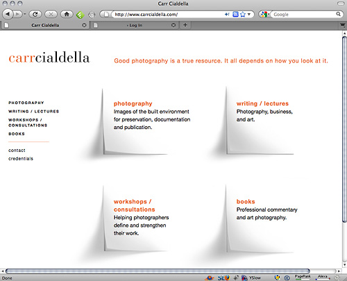
By far the most elegant implementation of WordPress for a photographer's website that I've seen is Susan Carr and her partner Gary Cialdella's site.   It does very well in search for the keyword phrases they target.

Another well done WordPress site that does well in search and doesn't look like a blog is Andrew Pogue's tasteful site.

A photographer's blog, implemented in WordPress, that does incredibly well in search is Mary DuPrie's "Photographing Models" blog.  It also helps her studio's main site rank well in search because each is hosted on a different server and her blog copy is written intelligently/correctly so as to to improve her search rankings for both sites.

Flash content is OK with workarounds such as browser client tests and at least some control over the content on your home page.  Few Flash-based sites give you full access to your home page's source code.  There is one Blue Domain (!) template that does so in a clever way, but I'm not sure they even realize it does.  Off-server landing pages can also help, but it's a slow road to page one using that tactic since the domain for such pages will likely be younger in age than the sites on Google's or Yahoo!'s first page.  Age of domain is becoming an increasingly important factor in search.

What do you think?  Have you seen an amazing implementation of WordPress by a photographer for their main site? 

Page Load Speed a Metric in Search

This post is now hosted at my SEO-only blog www.go-seo.tips. Just click the headline above to get there!

How is Your Website’s Usability?

Like every photographer out there, you have website. By now, you’ve made the design decisions that give your site its “look and feel.” The two most important considerations you may not have given much thought to are, one, your site’s visibility in Google and Yahoo! search results; and two, your website’s usability. In this article we’ll focus on the usability aspect of website design.

Listed below are a few items to consider when either designing your new site or redesigning your existing site:

Communicate Your Message Clearly
Today’s photographic buyers and art directors allocate minimal time to initial website visits, they’re primary goal is to locate a photographer (or two, or three) that “fits the job.” So you must quickly convince them that spending some time on your website is worthwhile.

Provide Information Your Potential Client Wants
Photo buyers must be able to easily (and quickly) determine whether your sample images and capabilities meet their needs and why they should do business with you. What is it that you can offer that your competitors do not? What differentiates you from the other photographers they’re considering? Is it your style? Your experience? Get your message out right up front, or make it easy for them to get to this sort of information within your site.

Offer Intuitive, Simple Navigation and Pleasing, Consistent Page Design
Remember your reader. He or she will learn the “flow” of your web site if you provide consistent, predictable navigation methods and content that shares design elements from page to page throughout the site. Provide “quick links” that serve as easily accessed shortcuts to the paths that you believe people will want to follow most often, such as your portfolios. Don’t bury important links in body copy. And be sure to use a pleasing color palette. If you aren’t familiar with Adobe Labs’ Kuler initiative, here’s an online article about it from Communication Arts magazine.

Equally important, don’t have links that only appear when a portion of a photograph is rolled over with a mouse. Studies have shown that a person arriving at your website from a search engine query will click the ‘back’ button if they don’t find what they came for after seven seconds.

Content, Content, Content
I can’t stress it enough. We all show pictures on our websites. Don’t forget to “introduce yourself” to your website visitor. Share some personal information with him or her. These days we’re getting less and less “face time” with potential clients, so you need to let your website do your selling. We all shoot great pictures. Here’s a few things you could write about on your site: your working style, your clients (don’t go overboard
here), your experience, what it is you do when you’re not working. Maybe your last great assignment; here’s where a blog can be a useful tool, but only if it matches the “look and feel” of the rest of your site. And today, more and more photographers are including some sort of “behind the scenes video” on their sites.

Hopefully these thoughts will get you thinking about your internet presence. Look at other photographer’s sites and put yourself in the position of a first time visitor. What is it you like, or don’t, about the site? Was it easy to move around in? Was your experience a good one? Or did the site’s flash animation require you to roll over the beautiful model’s eye for the “Portfolio” link? You get the idea, now go work on your studio’s website!

A version of this article first appeared in ASMP’s Professional Business Practices in Photography, (Seventh Edition).